Colour has a powerful ability to dictate the ambiance and atmosphere of your home design. Using colour psychology to design a space can cleverly control emotions and express your personal style on a deeper level. Let’s delve into the fascinating world of colour in interior design and have a peek at some practical advice on how to utilise colour effectively to change the ambiance of your house. And, if you're interested in interior design, don't miss out on details of our extensive interior design courses towards the end!
Colour Psychology
Colour psychology investigates the emotional and psychological impacts of colour. Warm hues such as red, orange, and yellow can evoke feelings of invigoration and can create a stimulating environment. They have the ability to generate a lively and dynamic feeling, making them suitable for communal spaces such as living rooms and dining rooms. Cool hues on the other hand, such as blue, green, and purple, have a calming and soothing effect making them ideal for bedrooms and relaxation areas. Neutral shades such as white, grey, and beige are very versatile and can be used as a base and to unify an array of colour schemes.
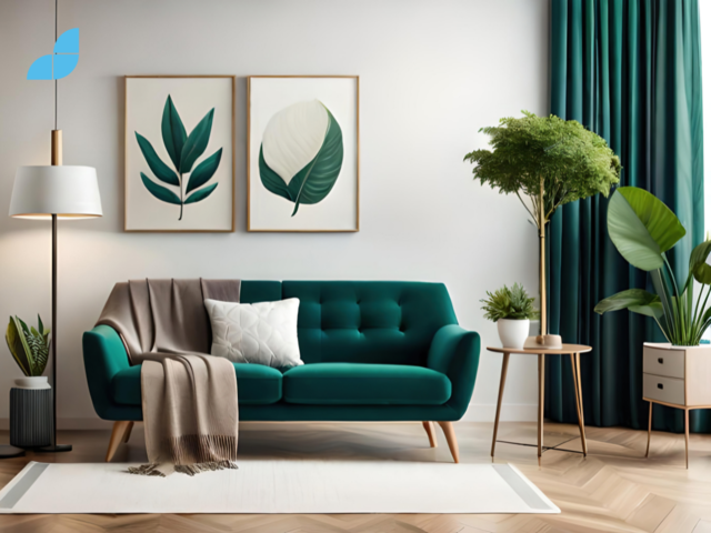
Creating Serenity with Cool Tones
If you are designing a space that requires calm and tranquillity, cool hues such as light blues and greens work well. They are reminiscent of quiet coastal scenes and can produce a feeling of serenity and peace. These colours are appropriate for bedrooms, bathrooms, and meditation spaces where relaxation and rejuvenation are needed. Using cool tones on your walls, bedding, or drapes and adding soft accessories will create a relaxing haven in which to unwind and rejuvenate.
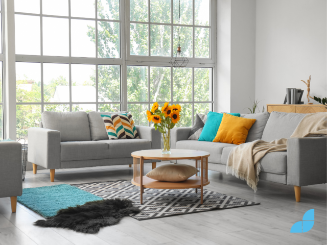
Energising Spaces with Warm Tones
If you want to add vitality and vibrancy to your home, choose warm hues. Red, orange, and yellow colours can elicit feelings of creativity and energetic warmth. They are ideal for spaces where people congregate or perhaps where inspiration and creativity can be enjoyed. Living rooms, kitchens, and home offices are all areas that warm hues work well and they can be used in many ways. Accent walls, furniture, artwork, or decorative accessories can create a welcoming ambience that stimulates interaction and can even inspire creative ideas.
Cosy and Inviting Neutrals
A neutral background can be a blank canvas for lots of additional colour and is an opportunity to create a base for numerous additional elements. But they can also provide a clean and fresh monochrome palette. White, beige, and grey colours inject elegance, and timelessness. These neutral tones are ideal for creating a warm and inviting environment, especially in spaces where relaxation and togetherness are desired, such as living rooms and dining areas. These shades are popular in Scandinavian designs where Hygge (cosiness and relaxation) is enjoyed.
Accentuating Drama with Bold colours
If you want to make a statement, incorporating bold and brilliant colours can inject great drama into a space. Deep purples, rich blues, and vibrant yellows can create artistic individuality as well as a touch of refinement to a space. Use these vibrant hues as highlights on focal areas such as an accent wall, a piece of furniture, or artwork. By contrasting strong hues with more moderate tones and neutrals, you can create visual harmony and keep the area from feeling too crowded. Don’t be afraid of strong colours, when used well, they can really add life to a space.
Harmonising with Colour Schemes
Consistency and cohesion of colour throughout your home is a good way to create balance. There are many approaches to colour schemes, such as monochromatic, complimentary, or analogous. Monochromatic schemes employ variations of a single colour which can result in a calming, harmonious space. This works particularly well with neutral tones. Complementary schemes combine hues on the colour wheel that are opposite one another to create colourful and eye-catching combinations. Analogous colours are colours that sit next to each other on the colour wheel.
First decide on the ambience you want to create, then look at the colour palette that will encourage that feeling. If you want to add depth and complexity to your design, experiment with different tones, tints, and textures within the chosen colour palette.
The Impact of Natural Light
There is no colour without light so it is imperative that an interior designer always considers the light that is available in a space. Natural light is generally prioritised and can have a huge impact on the mood of a home or room but it’s important to note that the strength and direction of sunshine can change how colours appear throughout the day. In the northern hemisphere, east-facing rooms enjoy the morning light, but west-facing rooms receive warmer, more powerful afternoon and sunset light. North-facing rooms will have cooler, indirect light, which is great for cooler colour palettes, but south-facing rooms get bright, warm light all day.
The orientation of a room will impact how natural light will interact with the colours you chose. Experiment with paint samples and materials to observe how they react to different lighting conditions. Maximising natural light with strategically positioned windows, skylights, and mirrors can improve your home's overall mood and atmosphere.
Creating Balance and Contrast
When using colour in your home, balance and contrast are key. While contrasting colours can create a space that is interesting and dynamic, adopting a single colour can create a harmonious and peaceful effect. The colour wheel is a very useful tool to help designers find complementary or contrasting colour combinations.
As you choose your colour palette, be sure to strike a balance between bold and delicate colours, bright and dark tints, and warm and cool tones. The interaction of opposing hues can be used to create interesting focal points as well as creating zones in a space while provoking desired emotions.
The Versatility of Colour
While colour psychology will inform a designer on the feelings and ambiance that can be generated, it is also important for a designer to include their own personal association with colour and to express their own emotions. Don't be afraid to follow your gut and explore colours that speak to you. Experiment with different combinations, pay attention to how they make you feel. Colour trends can shift over time, so try to lean towards timeless colours and look at trends as inspiration rather than requirements.
Colour is a powerful tool that can shape the mood and ambiance of your home. By understanding colour psychology, experimenting with different hues, and embracing the interplay of light and contrast, you can create a harmonious and captivating living environment. Our comprehensive interior design courses are designed to provide you with in-depth knowledge of colour theory and guide you in using colour effectively. Join our academy today and embark on a colourful journey of design excellence!
Ready to master the art of using colour in interior design? Explore our comprehensive interior design courses. Start creating mood-altering spaces with confidence and creativity!